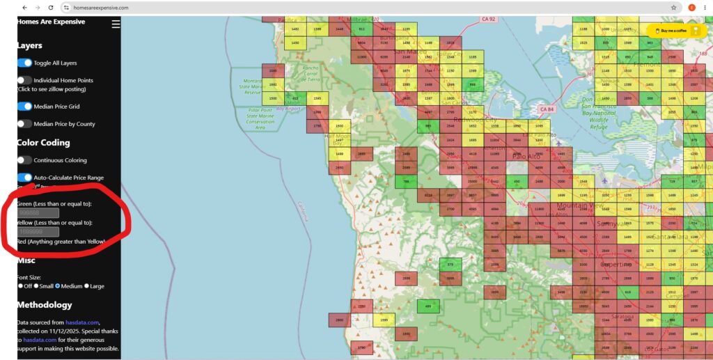
homesareexpensive.com is up again. I’d love to share the fix, but I don’t completely understand it. The tl;dr is that fullchain.pem and privkey.pem were out of date in the docker instance, so they had to be manually copied from the host; until then dates were appearing as invalid, which meant the entire webpage just went to an “insecure” page and was just broken. The thing still uses Hostinger, and Smack still owns the domain while I temporarily own the virtual machine.
You can search up median statistics on your own, but this is pulled from Zillow data. I have lived in greater Sacramento for a long time, and I want to scientifically prove to my friends here that they can never leave me.
So here homesareexpensive is, focused on a random portion of the Bay Area. The quick-and-dirty calculation shows that when we break median house listing price into thirds, Bay Area houses are “green” at or below $999,888 and “yellow” between that value and $1.7 million.
Compare that to Sacramento.
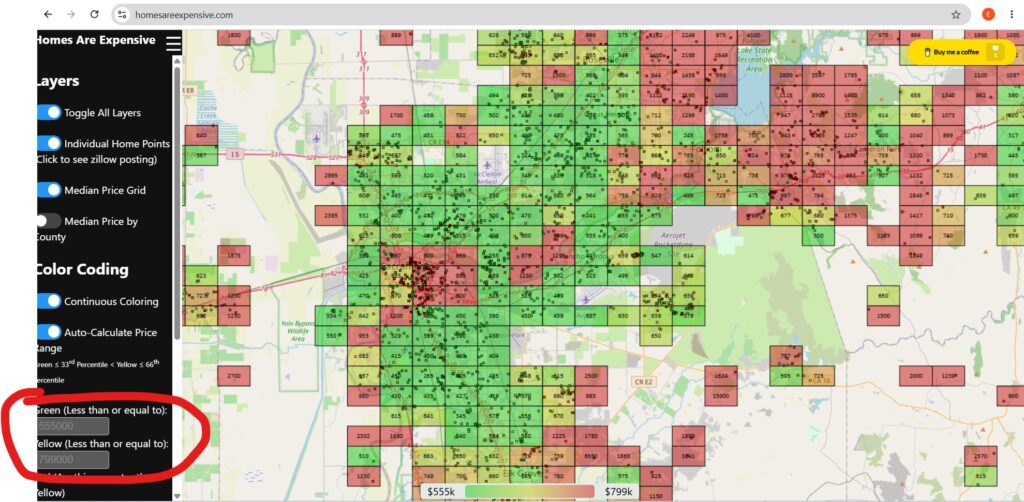
Here it is, zoomed into an area consisting of Sacramento proper, including some smaller greater Sacramento towns like Roseville and Lincoln but extending as far as Elk Grove. Here, calculated “green” and yellow” prices are much more affordable at $555,000 and $799,000.
I can detect the eye rolls already, but the website allows you to zoom into virtually any part of the United States to compare these Zillow listings. It will automatically re-calculate the green/yellow/red cutoffs and update on the lefthand side. Instead of using Zillow’s map feature alone, you can get a rough idea where “affordable” prices are.
Caveats
The first time this was posted to Reddit, one user noted that it did not account for size. I was really excited to find something in a nice part of Oakland for around $400,000 (if I remember correctly), only to realize it was a condo.
Another thing is that the data is a little stale, and will continue to get more stale.
For all the work it required to get county coloring working, Reddit seems to oppose it. County coloring is not relative, so the entire country gets corrupted by absurd “red” prices and everything looks like an oversaturated green. The relative grid coloring is probably more useful as it was originally.
Smack’s original motivation was determining how affordable southern California was for someone of his salary. So here it is zoomed into a few areas focused around San Diego.
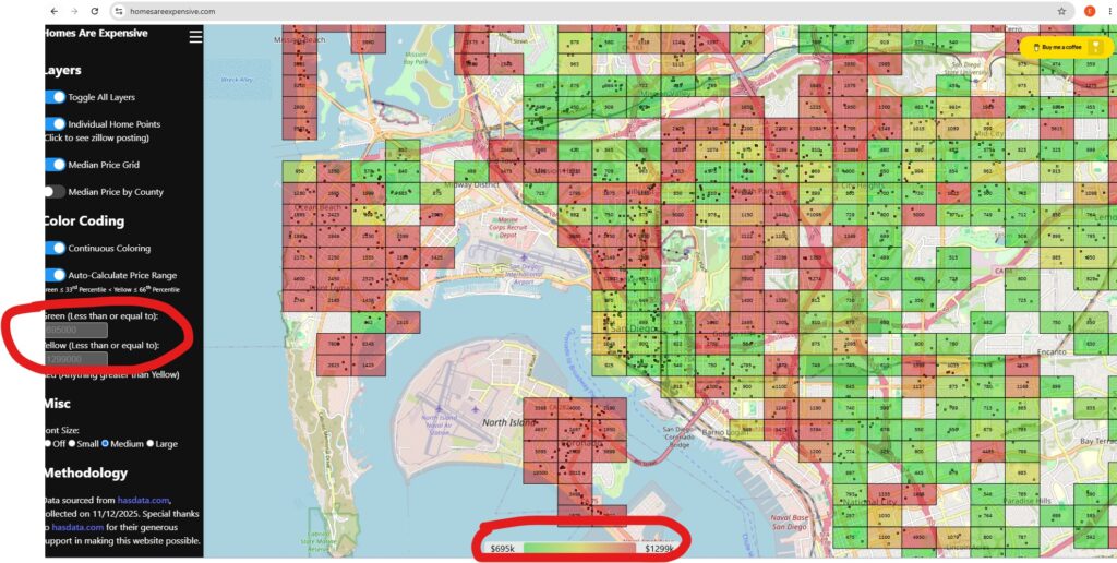
Green cutoff up to $695,000, yellow $690,001 to $1.3 million. For some of us the math just doesn’t math. Then if you target green areas and actually click on Zillow listings, you may find that the actual properties are tiny.
Closing Thoughts
The reaction to the update last year was disappointing (one Reddit user went as far as to say it “looked like vibe-coded leaflet with the copyright removed”), especially compared to the very positive reaction Smack got the first time around…but there it is. It’s up again.
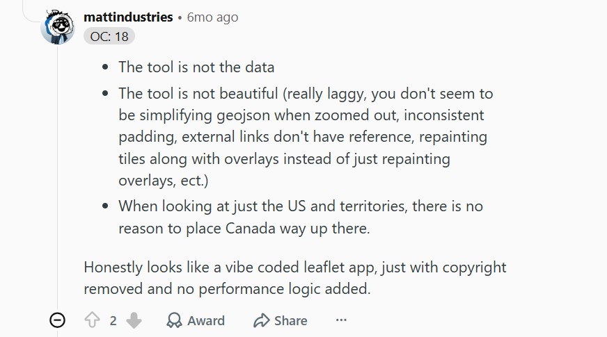
Also, I think that we can…kind of see it now. It really is quite laggy. To be fair, that’s at least in part because it now handles so much more data.
The one could thing about the updated Reddit release is users provided a roadmap for things that could be improved. I will own the virtual machine at least until November of this year. At that point, we may discuss whether to keep it up.